AMO Opportunities
AMO Opportunities
The Challenge
AMOpportunities and PreceptorLink both solve the same core problem: connecting healthcare trainees with the clinical placements they need to graduate. Yet they were built, and had grown, as two separate platforms, each with its own database, its own logins, and its own product logic. When the two companies joined forces, the opportunity was obvious: combine the databases, combine the reach, combine the support.
But the platforms weren't built to talk to each other. Two systems, two brands, two ways of doing the same thing, running side by side instead of as one. Our job was to design the merge.
UX Research
We didn't start with screens. We started by understanding both platforms from the inside out.
Interviews. We spoke with the teams and users behind both AMO and PreceptorLink to understand how each platform actually operated day to day, and where their models overlapped, conflicted, or duplicated effort.
Usability testing. We put both existing platforms in front of real users and watched where they hesitated, backtracked, or gave up. These sessions surfaced the friction points that internal teams couldn't see from the inside: overlapping terminology, redundant steps, and inconsistent flows between the two systems.
Analytics review. We paired what we heard with what the data showed: drop-off points, navigation patterns, and where each platform's structure was working against the other rather than with it.
The result was a clear picture of two strong products that had never been designed to sit under one roof, and a roadmap for what merging them properly would require.
The Design
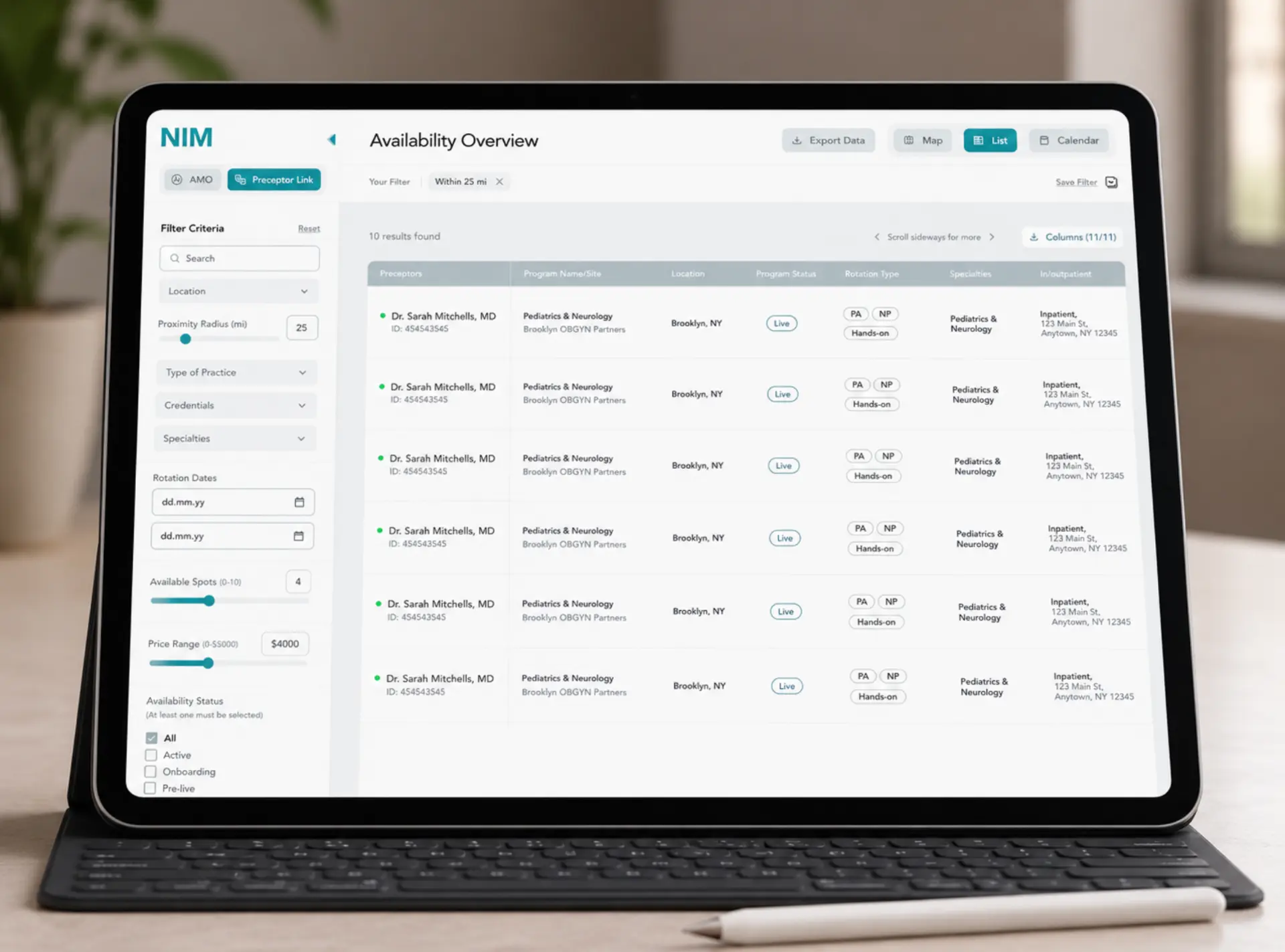
With research as our foundation, we rebuilt the experience around a single, unified system, rather than patching two platforms together.
That meant:
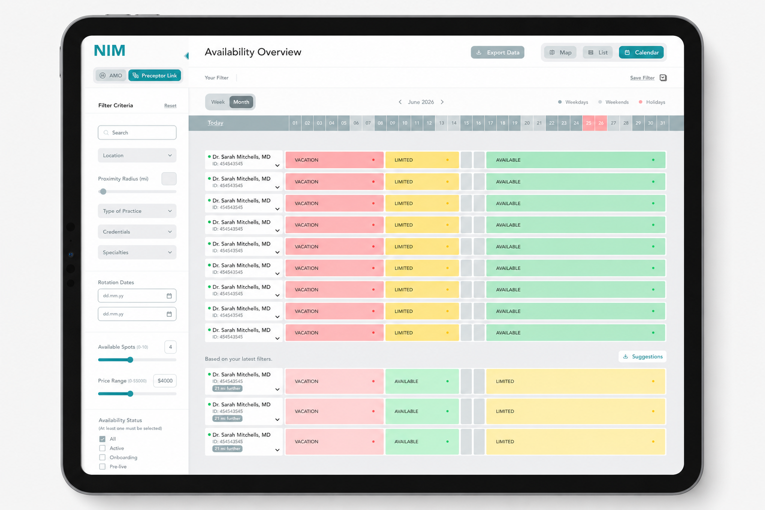
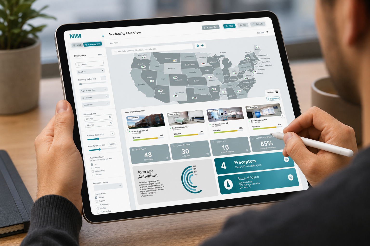
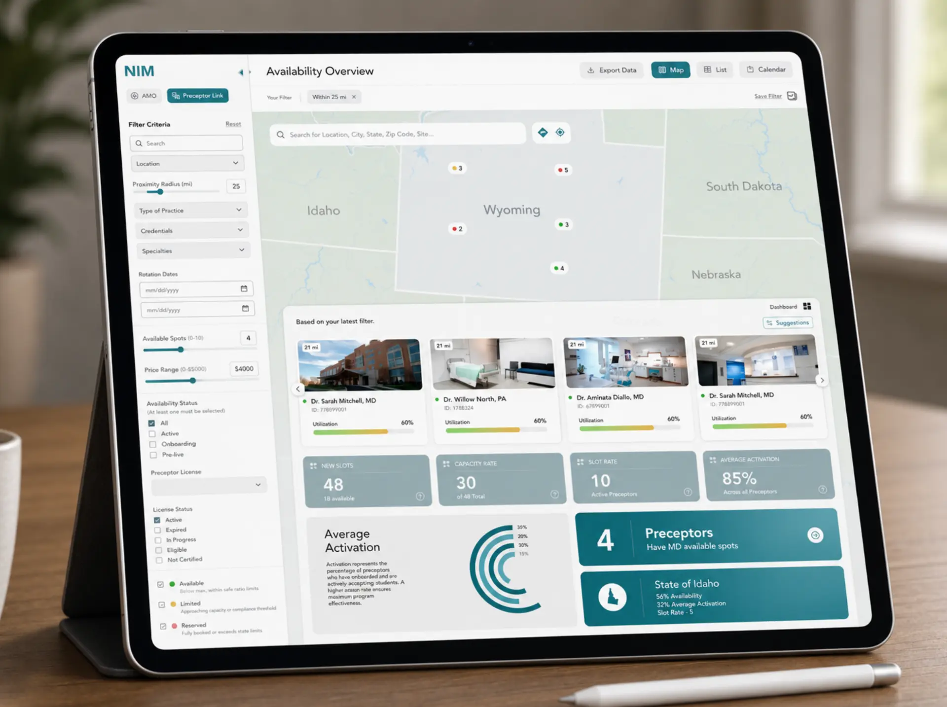
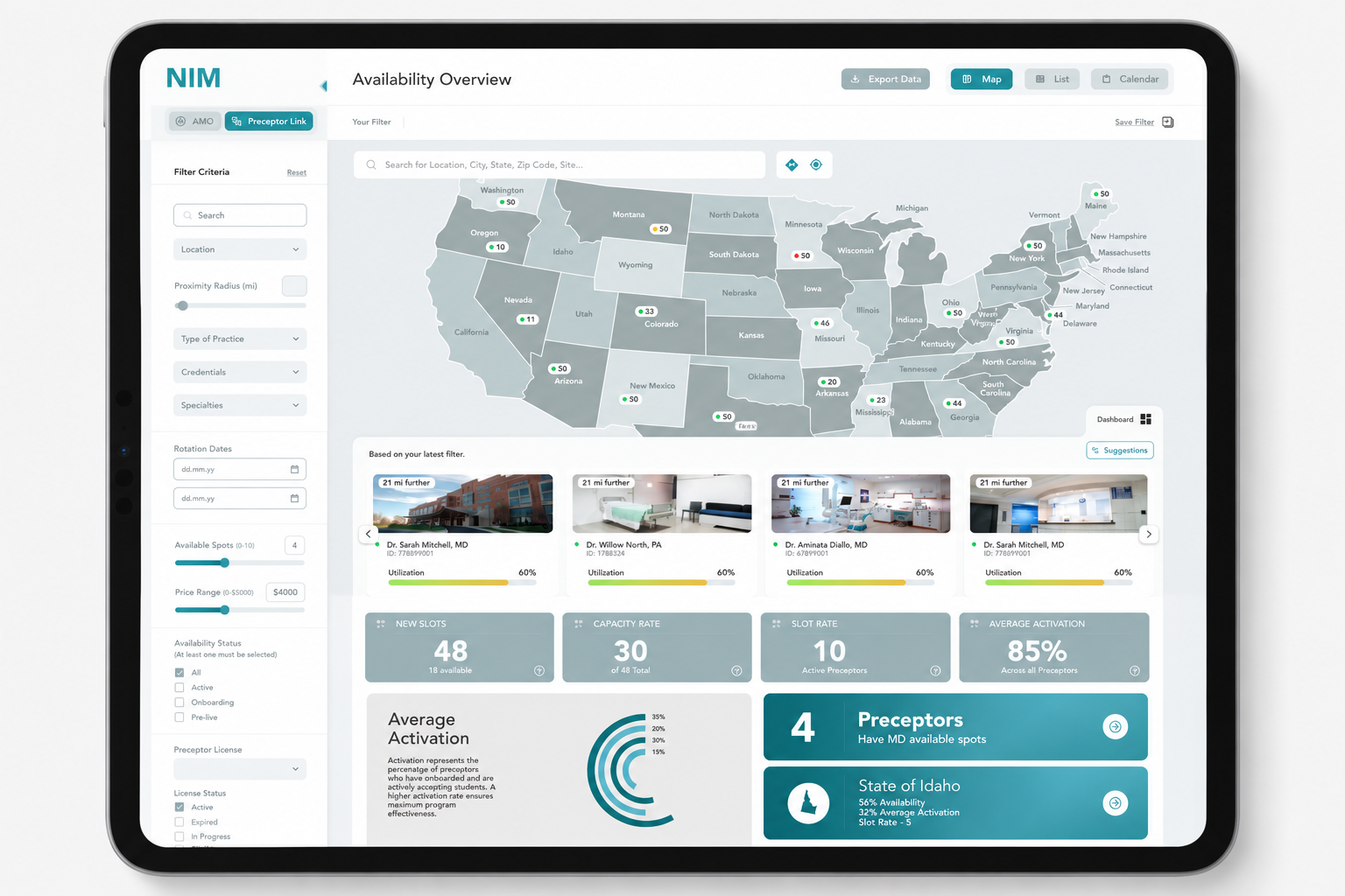
A unified information architecture bringing AMO and PreceptorLink's separate structures into one coherent system.
Consistent, simplified navigation that replaced duplicated flows with one clear system that works the same way throughout.
A shared visual and interaction language across AMO and PreceptorLink, so the partnership feels intentional rather than bolted together.
Streamlined core flows, cutting the redundant steps that usability testing showed causing friction.
The Result
An app that gives both platforms, and everyone who relies on them, a better overview and a better experience overall. AMO and PreceptorLink now operate as what they always were meant to be: one trusted, unified product, not two.